Table of Contents
There’s a reason why web apps like Netflix and Google Drive have millions of daily users, and it’s not just because of the services that they offer – the platforms are also extremely easy to use.
Truth is that user-friendly is an expression that is thrown around often in web app design, but what does it actually mean for your application and your users, and how can you achieve it?
Think of your favorite web app. What makes it your favorite? What does it look like? How does it flow? Now think of a web app that you started to use, but never really got into. Why? Was the layout too confusing? Was the jargon too specific? The loading time too slow? Your answers to these questions will reveal the effectiveness of the web app’s UI/UX design. Let’s explore some top tips for UI/UX design that will help you connect your web app with both your business goals and your buyers’ needs in a visually appealing way.
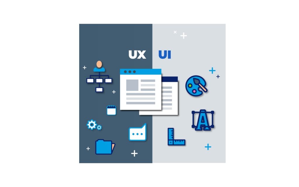
Understanding your user’s needs and your company’s goals is the first step to achieving a truly user-friendly app design. How do you do that? First, you must acknowledge the relationship between UX and UI design.
A User Experience (UX) designer taps into industry analytics and user feedback. Combining that with their creative expertise and knowledge of industry trends they make a buyer’s experience more enjoyable. UX design choices affect the appearance, functionality, and purpose of an app. A highly successful UX designer is quite empathic; they design in a way that truly reflects the users’ needs.
Once a UX designer has a functional and consistent blueprint, a User Interface (UI) designer then considers the visual appeal of an app. They focus on style, color, textures, and how the user interacts with features. To create a thoughtful, responsive web application, one simply doesn’t work without the other. Conveniently, most web designers can execute both UI and UX design tasks.
Now that we’ve looked at the relationship between the two, let’s cover 9 essential tips for UI/UX design to make your web app the friendliest it can be:
UI Design Tip: Always Judge a Book by its Cover
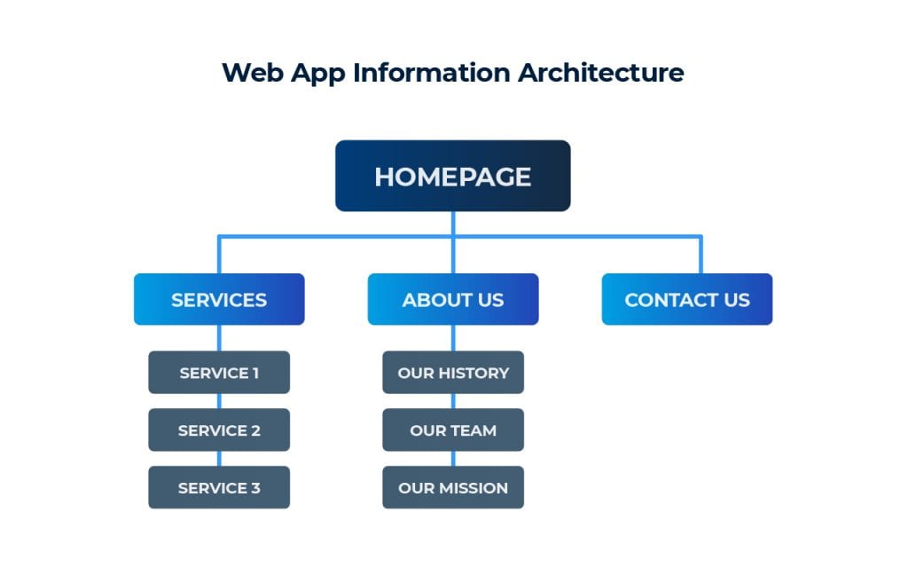
Humans make quick judgments within a millisecond of seeing something – it’s our nature. So, try to engage your users by making your web app highly approachable and visually appealing from the very first glance. Don’t worry about trying to be the most innovative when it comes to design. Instead, consider information architecture and basic user flows before creating any pages. Here is a simple example of streamlined information architecture for a web app.
Be sure to discuss, test, and iterate all primary elements with your team and users to find the perfect ratio.
“As a designer, you want users to recognize rather than interpret new design patterns. This not only saves your target audience time, but it also makes the content more approachable.” Francis Pujols, Scopic Designer
Consider how color, icons, and placement can either accurately communicate your message or completely alter it:
- “Read this first!” If you clicked on an article that was written in red like that, what do you think it would be about? Most people will consider it a warning or something negative. That is just how the mind interprets it. So, keep that in mind when choosing colors. Also, be sure to consider color blind and low vision users as well.
- Think of what your icons might represent in the real world (specifically in the community of users your web app is targeting).
- Consider natural placement and flow for the human eye to follow.
UI Design Tip: Help Your Users Make Quicker Decisions
Your web app’s navigation tools should function as a simple table of contents for your site. Keep the structure here streamlined by grouping related elements together. If you are working on a fitness web app, you don’t need two menu options for cardio and plyometric workouts. The standard number of menu items is 5-8. This is based on Hick’s Law, which explains how decision-making time is affected by the number of menu options (hint: more choices = more time).
Pro tip: New users should be provided with tooltips to guide them through your web app when needed. It ensures that they won’t just get overwhelmed, leave the app, and search for an alternative. Make sure that these tooltips can also be skipped by the user. You don’t want something that’s useful for some to be an annoyance to others. This is especially important if your app has a free trial as the user’s experience during this phase will determine if they purchase or not.
UI Design Tip: Consider Those Thumbing Through
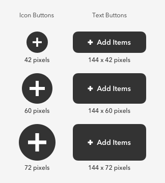
When working on the wireframe, consider how your users interact with the mobile-friendly version of your web app. Unlike on a website that offers more space for scrolling, your mobile users navigate with only a finger. So design buttons that a thumb can easily click. Create forms that users can fill out from their phone keyboard. And provide concise information that can be digested easily from a small screen, where mouse hover-over states are not available.
Consider these recommended button sizes for each device that you are designing. (Source)
UX Design Tip: Design for Return Users
Just like you need to have support for new users, keep efficiency and personalization in mind when designing for your returning visitors. 59% of customers say tailored engagement based on past interactions is very important to winning their business. If you’re on a fitness app development journey, for instance, it’s a good idea to remove workouts that the user hasn’t selected or shown interest in.
Consider how you can make a return user’s experience as streamlined, personalized, and effective as possible. This may include offering returning users the option to save log-in information, payment information, and auto-fill forms on your web app. Providing recommendations based on your users’ personal preferences will connect them more emotionally with the app.
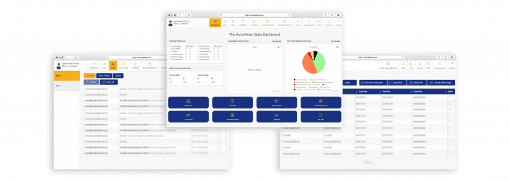
Check out how UX design affects the flow of this automotive sales web app that the Scopic team developed. Every user of this multi-channel marketing platform can create unique lists and customized work plans to suit distinct customer groups. This not only helps the sales team reach potential leads more quickly, but it also enables them to create a personalized workflow for themselves. This saves time and makes the user’s experience feel more natural.
UX Design Tip: Keep Consistency for All Users
There are always going to be differences between your web app and the mobile-friendly version, but they both need recognizable characters, designs, and content. Their flow should be similar and the overall feel of the app should be consistent across all channels and devices.
“Consistency and style guides make the user’s experience on different devices still feel like they are from the same design system.” Antonella Iselli, Scopic Designer
Any user that already knows how to navigate your website should be able to interact with your web app easily and vice versa. Make sure that your application is part of your identity language: text styles, identical colors, and overall UX design.
UX Design Tip: Be Mindful of Your Locution
Here’s an example of what not to do: don’t use the word locution when you can just say word-choice. Avoid using any words that are going to confuse your reader or just feel awkward in your app’s setting. Feel free to use any jargon that your audience would expect, but don’t waste your time explaining terminology if it isn’t absolutely necessary. In the same way that you keep your audience in mind when creating the copy, you must also connect the copy with the design. The two should be used in unison to relate to your audience and help them reach their end goal as easily and smoothly as possible.
This is where fully understanding your user is key. Who are they? What are their goals? What context do they have? How much time do they spend on your app? Are they IT professionals or would words like ‘UI’ and ‘web app’ scare them away? Design in the language of your users.
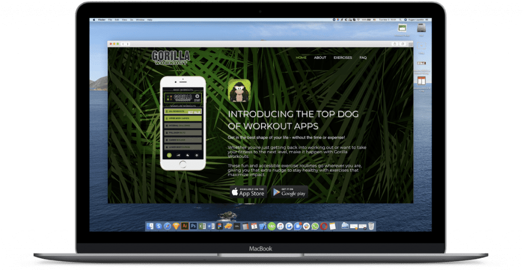
Here is a UI example of specific industry jargon that has been appropriately used based on the functions of the app and the target audience that it was designed for.
UX Design Tip: Run, Review, Repeat
There are three certain things in life: death, taxes…and client feedback. Clients love giving feedback, which is essential for maintaining an effective app. Both positive and negative insights help maintain a user-friendly web app. Once you think you have a perfect flow, test it. A/B testing will help you see which menu tabs, button colors, and log-in options work best for your users. Usability tests and client surveys will gauge your app’s friendliness.
Remember, the user is your friend. And just like with any relationship, you have to constantly work at it to ensure it lasts. Once you have run extensive testing and surveys, switch it up. Change a variable and see where that takes you.
UX Design Tip: Engage Your Users
Keep your users in the loop at all times through clear system statuses. If your app is under construction, be sure to make that clear. If something is loading, use a symbol like a spinner or simply add the word “Loading!” to keep your user informed. After all, a well-informed user is an engaged user.
“A user-friendly design should eliminate confusion by always subtly giving the user an idea of where they are and what is going on.” Ljubo Ljesevic, Scopic Designer.
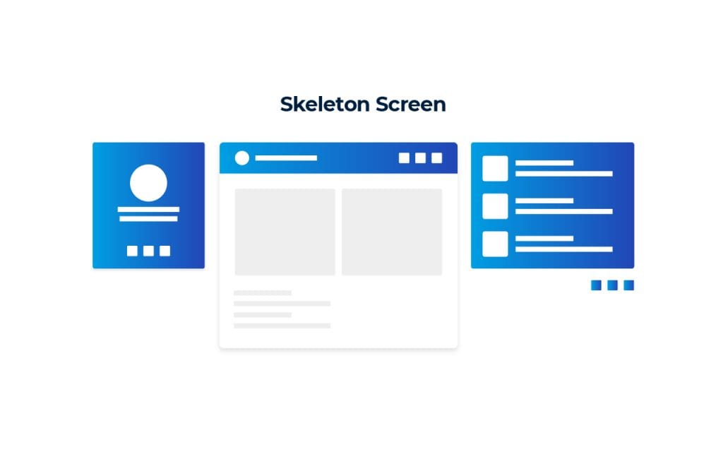
Consider this skeleton screen that users view while the web page is still loading. This will automatically show, letting the visitor know that there isn’t an issue with the page, it is just loading.
UX and UI Design Tip: Always Consult an Expert
The surefire way to see quicker ROI from your web app is to work with design experts who do this for a living. UX/UI designers collect information from direct competitors, articles, and reports. They are experienced in interviewing and running remote user testing with actual users. They not only collect the information, but they know what it means and how to apply improvements based on the findings. Reach out to a professional to ensure you are optimizing your app’s UI/UX design. With the right team by your side, you will capture and engage your users straight away.
Behind every user-friendly web app, user interface and user experience design are working hand in hand. So, start with these 9 tips for UI/UX design when creating yours. But remember – maintaining a truly user-friendly app is an ongoing process. Once you have an effective product up and running, it is time to test and repeat to make sure you’re always living up to your users’ changing needs and expectations.


