Table of Contents
Imagine you are designing the inside of a store.
You would likely place your best-selling products in the front of your shop, have appealing and informative displays throughout, and maintain a simple layout, right? Well, that’s exactly how you should approach your website design, as it is essentially your company’s flagship store. If visitors land on a page that isn’t informative, appealing, and intuitive, the question isn’t if you are losing sales, it’s how many.
The Power of Thoughtful Web Design Services
So, how important is web design? The numbers speak for themselves — nearly 75% of people state that they make judgments about a company’s credibility based solely on their website’s design. This means that if you have four people visit your website, you can be sure that at least three of them will be basing their final purchasing decision on the look, feel, and flow of your site. You really can’t afford to skimp on design. 
4 Common Website Design Mistakes to Avoid
Like many small to midsize business owners, you may outsource your website’s design and development tasks. While this can be a great way to get the work done quickly, you have to be selective. If you don’t work with highly-trained designers, you can easily fall into some of the common pitfalls of ineffective website design. This often means that you are also losing potential clients.
Here are 4 common website design mistakes that may be holding your business back (and how to fix them!):
1) Your website design isn’t streamlined
Too often, companies include impertinent or superfluous information on their site, forcing their visitors to jump through way too many hoops to get to the meat of what they are searching for. This is a sure way to drive up your bounce rate. Don’t give visitors too many decisions to make. Design your website intuitively and lead your audience to information that they want and need to see. Consider that nearly one out of every two people will trust a new company much more if they have clear and thorough contact information. Now take a look at your site. Are your contact details easy to locate? If not, your site structure may be directly impacting sales.
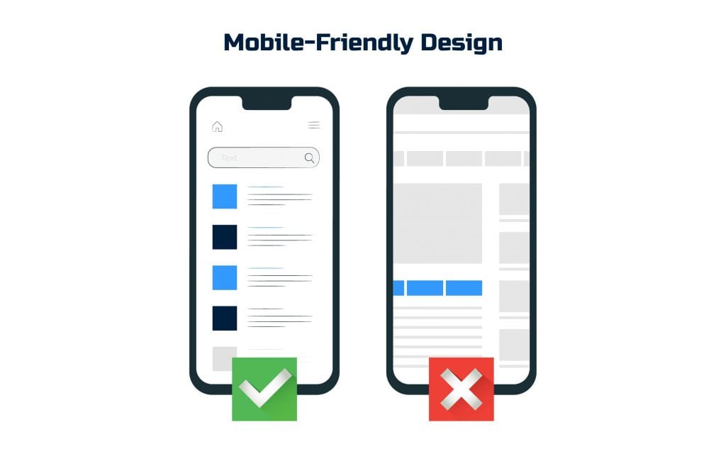
2) Your website isn’t responsive or mobile-friendly

- Optimizes the font and button sizes for mobile
- Has clean and simple content and visuals
- Has easy-to-find contact and product information
- Is responsive across all devices
- Is continually tested and optimized
- Can be easily navigated on all devices
- Is consistent throughout
3) Your website has unappealing images and visuals
When it comes to designing visuals, be it your logo, graphics, or icons, remember to factor in the basic design principles of color theory. Take it one step further and consider the psychology behind the colors that you choose. When designing a call to action, for example, factor in that the color orange attracts impulse buyers while teal speaks more to buyers on a budget. Your color scheme should appeal to your target audience. When choosing images, be sure:
- They are high-quality (a key factor in website speed)
- You include some images with humans in them to engage and emotionally connect with the visitor
- You remember that with design, less is often more. A simple, streamlined website is more effective in converting more leads into customers
4) Your website is slow
Consider this: a webpage that takes one single added second of loading time can cause sales to drop by 27%. This means that simply because of a slow website, you may be losing qualified leads in the blink of an eye. But what’s making your website slow? It can be a variety of things, including unoptimized images, outdated Flash content, clunky code, and more. The best way to diagnose and fix performance issues is to bring in web development services that specialize in speed optimization. They’ll pinpoint the problem and get your site running at full capacity.
3 Essential Website Design Tips to Boost Conversions
There are also concrete website design rules that, if followed, can boost your visitor’s experience and guide them smoothly along the sales funnel. When optimizing your website, follow these 3 website design tips:
1) Design CTAs that encourage action
The design of a call to action button is just as important as its text. You must provide attractive and intuitive CTAs to help guide your potential clients where they need to go (and where you want them to be). What design aspects are key to increasing your click rate? For starters, simply designing a call to action button instead of just a hyperlink can boost clicks by up to 45%. Be sure that the shape of your CTA is consistent with the brand’s design, that the color connects with the mood and purpose of the action you are encouraging, and that it is appropriately placed on the page. To find the right location for your CTAs, test, test, test! Simple tweaks can drive massive results. 
2) Implement website design AND SEO best practices
Remember that search engines can’t see your website designs. That’s why you need to tap into the power of SEO. Make sure you communicate all of the important aspects of your site in a language they can understand. You may have a visually-striking website, but if the designs, images, and content headings aren’t properly labeled, a search engine like Google will never know they exist. Following can dramatically drive up your website’s search engine ranking, which, in turn, boosts traffic and incoming leads. Here are a few SEO tips to follow to make the most out of your website redesign investment:
- Optimize the speed of each of your webpages (a known ranking factor)
- Create descriptive URL structures
- Properly format and label images (image name, alt text, proper size)
- Design a mobile-friendly site (a major ranking factor for Google)
- Provide an effective site map that communicates to search engines what elements of your site are most important
And the list goes on. Your SEO team should be translating all of the hard work your designers have done to properly reach those hungry search engines. When in doubt, don’t hesitate to hire an SEO services company.
3) Design your website for your specific audience
When working on a website revamp, don’t just guess what your audience wants to see, ask them! Try different colors, visuals, and styles, and then test each of them with your audience. Once they see their perspective reflected on your site, it will connect them more deeply with your mission and product. Take, for example, ESPN. They were able to increase their revenue by 35% after requesting and implementing audience input on their homepage design. Simply acting on the suggestions made conversions rise. The power of selling to your audience is massive.
The Benefits of Redesigning a Website in Action!
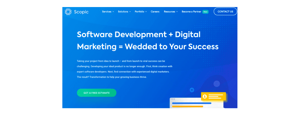
When it came to redesigning the Scopic website, our main challenge was ensuring that our clients could get where they needed to go quickly and smoothly. As a software development services, digital marketing, and website design company, we wanted to make sure we included all of our vast service offerings on our site without overwhelming the visitor.
Scopic Website Before
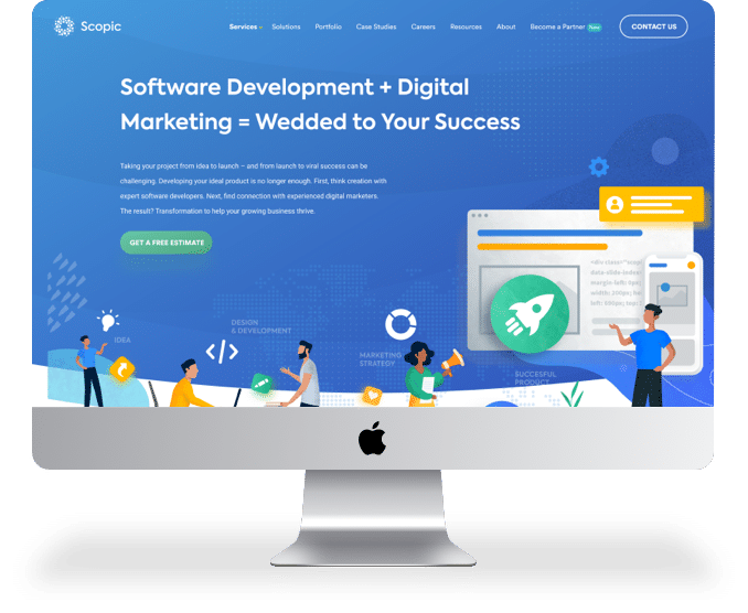
During the custom website design process, our developers created a fully-responsive layout that properly and swiftly renders on all screens. We also implemented a large number of improvements including cleaner visuals and newly designed illustrations, an SEO overhaul (with a newly optimized URL structure), consistent CTAs, a reworked sitemap, and more.
Scopic Website After
The question of the hour: has Scopic seen a jump in incoming traffic and sales? Yes! After the launch of the new website, we tracked a 100% increase in leads. How about conversions? We also saw conversion rates increase by about 68%, or if we isolate traffic from solely Google, 112%. This is a clear example of how website redesign translates into more revenue. To get in on this action, think of your website as a store. It needs to be organized, visually representative of your brand, and appealing to the eye. Pro tip: Hire a ui ux design service company that also has developers on staff or at least offers WordPress website design services. This will get your newly revamped site off the drawing board and onto the webpage. Ready for more good news? While the benefits of redesigning a website are vast, you don’t have to spend an arm and a leg to access them. Get in touch with a reliable agency with affordable services and see first-hand why website design matters. Your sales team and customers will thank you for it!


 Scopic Website Before


